J.M. Henry left an indelible impression on those he encountered in Charlottesville. They remember his talent and commitment to art, his resiliency, his generosity, and his finely attuned sense of humor. “Interference: A Retrospective of the Paintings of J.M. Henry” at McGuffey Art Center celebrates the work of the artist who died in June 2025.
Henry, who moved with his family to Charlottesville in 2004 to be close to the UVA Medical Center, suffered from Alpha-1 Antitrypsin Deficiency, a rare and progressive lung disease. Originally diagnosed in 1995, he underwent a double lung transplant in 2012.
The retrospective exhibition is guest- curated by Deborah McLeod with the assistance of Henry’s daughter Alison and McGuffey member Scott Smith, and primarily uses work from the artist’s estate.
In 2016 Henry moved to Lawrenceville, Virginia, where he converted a warehouse into a work-live space. With characteristic humor, he referred to the town as “the village of Larrys” and “Larryville.”
McLeod sums up his spirit: “He was a cowboy—a funny, brilliant, kind, serious, funny (did I say that already?) cowboy. He rode the range alone, sequestered away in his big two-story warehouse in mostly deserted Lawrenceville, painting and painting, no matter his declining health. His art was his horse.”
Henry was a formalist who reveled in his materials and the facility with which he employed them. His palette and his compositional integrity reveal an artist of great skill and confidence.
Looking at his surfaces, you’re struck not only by his command of the medium, but the ease with which he creates stylistic effects—the subject is secondary. In fact, it almost doesn’t matter what he paints, it’s how he paints that counts. The medium is truly the message in Henry’s work.
Henry built up his surfaces with many layers of paint that he’d subsequently go over with grinders, sandpaper, hair dryers, and scrapers, producing texture and revealing glimpses of the layers beneath the top coat.
“Jim used a lot of very thin veils of color, one on top of another, allowing them to breathe through each other, with one hue interfering with another,” says McLeod. Other works show stylistic and compositional interferences where Henry causes a shift in direction by introducing an opposing factor into the composition.
“Because the hue and surface properties of the paint are the elements most important to me,” wrote Henry in his artist’s statement, “I try to layer various paint bodies in a manner which creates a luscious color field that at first appears static but gradually reveals the subdued energy of the drawing within.”
Henry was fascinated with printmaking and used various means to mimic the appearance of prints. “Edges were super important to him,” says McLeod. Though not a printmaker, he admired the way prints bleed onto the paper and would emulate this in his paintings.
“The edges are often left ragged to allow my process to reveal itself, and to extend the gestural internal drawing which is an integral part of that process,” wrote Henry. “I seek to create a unique surface that changes and shifts as the light does, or as the viewer changes position in relation to the painting.”
In addition to his print-like works, the show can be divided into three other categories of paintings: abstractions, abstracted seascapes, and works that reference major color field artists.
It’s not surprising that Henry embraced abstraction, given his focus on formal considerations, and his abstract work has real authority and presence. This is the case whether the work is a nearly monochromatic expanse of blue, or a denser, heavily worked painting featuring a grid of red circles against a murky wash of black over blue.
In his seascapes, Henry uses totally abstract elements to create the impression of topography, a harbor with boats, and architecture, as well as atmospheric effects seen across water. There’s something calming about these works, which boast low horizon lines that emphasize the sky.
It’s hard to tell what Henry was doing with paintings that resemble works by color field artists: “Dreamer” (Kenneth Noland), “Shield” (Clyfford Still), “Pylon” series (Barnett Newman), “Lark” (Jules Olitski), and “Shield” (Mark Rothko). Are they homages to artists he admired, or a flex of his artistic muscles? Maybe he was trying on another artist’s style to see how it’s done or how it feels—a practice that’s not uncommon.
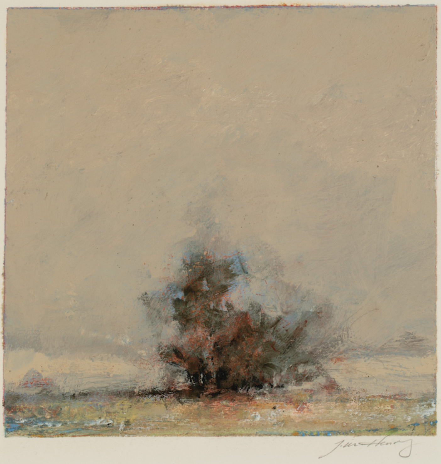
The curious form of one his small, untitled works—a fire? a dust devil?—depicts a figure largely composed of wind, dust, or smoke. Henry builds it up with masterly brushstrokes that describe its immateriality and sense of movement. He continues his virtuosic treatment of paint in the ground on which the mysterious form sits, where the marks of pigment coalesce into highlights and shadows and suggest the uneven contour of the earth. The superb artistry elevates this work of modest scale into something quite extraordinary.