Modern for a change
 |
Why do we love the two new additions to Campbell Hall, home to UVA’s School of Architecture? First, because of Dean Karen van Lengen’s smart and plucky decision to hire her own faculty members to design them. W.G. Clark’s tall East Wing, which presents a striking translucent face to Rugby Road, and William Sherman’s South Wing, where Buckingham slate and glass louvers call attention to natural connections, certainly vindicate her choice. What’s even better is that the Board of Visitors, notoriously conservative in architectural matters, signed off on the modern designs. Dedicated this October, the additions prove that construction at UVA can be worthy of neighboring a World Heritage Site without merely imitating it.—Erika Howsare
Subtle thinking
 |
Tristan Benedict-Hall’s t-shirt creations, printed on organic cotton with earth-friendly chemicals and water-based inks make more than a fashion statement. “I see a number of t-shirt companies these days marketing ‘green’ shirts, which is great,” Tristan says. “But slogans such as, Think Green! are easily brushed off.” With his men’s and women’s tees, he aims instead for thought-provoking, but subtle, designs. From “eye drops”—rain drops with baleful peepers—to human blood vessels putting down roots a la the plant kingdom, Tristan’s designs are full of playful punnery and a natural sense of style.—Lucy Zhou
Good vibrations
Entering Sublime All-Natural Food & Juice Bar on Elliewood Avenue, you feel happier and healthier. The place is light-filled, efficient, simple and modern in its obvious design, but the real beauty is in the positive energy flow created by part-owner and designer Stuart Madany, who applied BioGeometry in the design. BioGeometry is a new form of architecture developed by Egyptian architect Dr. Ibrahim Karim, which “uses shapes, colours, motion, orientation and sound to produce a vibrational quality that balances energy fields” (according to Karim’s website). By using particular ratios and proportions on the vertical and horizontal planes of the space, Madany has maximized good energy and minimized bad. We don’t understand it exactly, but we do know what we feel when we walk through the door: instantly better.—Katherine Ludwig
It takes a spillage
Finding a vineyard in this area is like shooting fish in a wine barrel. Which is why, when you find one that looks like it grew out of the earth it’s hard not to take notice. Willie Johnson’s design of Blenheim Vineyards merges new with natural by filling the back wall with panel windows and a deck overlooking the vineyards. That same natural light is repeated in the skylights, which dot the cathedral ceiling. A railed-off hole in the floor reveals the winery’s lower level of barrels and fermentation tanks. The winery’s clean lines, achieved with a careful arrangement of wooden beams and stark white walls, may also impress visitors. Though, white may have been a risky choice—with your Petit Verdot in hand (and mouth), a little spillage is only natural.—Caite White
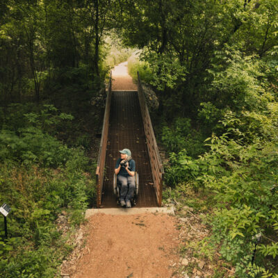
Emerging patterns
It’s not just a yard; it’s an experiment. Permaculture—an eco-minded, pattern-conscious discipline—says that you can design your entire homesite for maximum efficiency and minimum footprint: everything arranged to work in harmony with the flow of wind and water, sunlight and other elements. The first step is to observe what you have, and local designer Reed Muehlman (who daylights at Bushman-Dreyfus and is part of the Blue Ridge Permaculture Network) has done that thoroughly: His maps of his nine-acre Crozet property overlay each other to create a fascinating study of patterns that emerge when topography is compared to deer paths and tree shadows. And, drawn with an architect’s hand, they’re beautiful, too.—E.H.
You’re my archetype
Does “JPA” conjure images of Wahoo shenanigans and Solo cups as lawn décor? Clearly, you haven’t seen what’s cooking at 1707. With a focus on creating “sustainable models for urban design,” Fred Wolf of Wolf Ackerman Design has taken a quirky plot with a killer slope (think double black diamond) and worked architectural magic: the 10-unit apartment complex is compact, sensitive to both trees and housing needs, and darn sharp-looking to boot. Very refreshing, given the tired faux-historic look of many other recent student apartment buildings. With one-, two- and four-bedroom units serving different demographics, and incentives for off-site parking to reduce the impact of additional cars, 1707 is all about pulling together the pieces—University, community, and sustainability—as an archetype for future development.—L.Z.
Lush life
Although Thomas Jefferson was Monticello’s most famous landscape architect, designer Michael Vergason of Alexandria, Virginia, and planting teams at Monticello and Ivy Nursery have also made their mark on the mountaintop. Vergason’s landscape design integrates the new Thomas Jefferson Visitor Center and Smith Education Center into the existing forest by exploiting native trees, flowers, wetland sedges, grasses, and over 13,000 varieties of groundcover. Due to the unique challenges of planting a garden on a mountain prone to erosion, the design had to account for rainwater runoff, harsh weather conditions, and the pressures of sustainability. Now, even in the dead of winter, one can see the fruits of the work. A parking lot that once loomed heavy and concrete beside the historic African-American Burial Ground is now softened by the Greenway, a lush tributary for rainwater and pedestrians that provides a symbolic link between the Visitor Center and the Burial Ground. And a courtyard nestled between the various Visitor Center above-ground structures provides shade for tourists under a collection of honey locust trees.—Wistar Watts Murray
Image conscious
 |
C-VILLE Weekly is officially proud to share a hometown with the Virginia Quarterly Review. It’s even better to be a reader now, in the era of editor Ted Genoways, when the VQR looks nothing like a dusty litmag but instead does a flawless imitation of a national glossy. It’s “more like a low-budget National Geographic,” says Mark Reis, one of two partners in Minneapolis-based Percolator Graphic Design. Back in 2004, when Genoways became editor, he asked Percolator to completely reimagine the publication, with four-color printing, lots of images and a stylish aesthetic. The result: interiors that grip the reader and covers that pop off a newsstand shelf (though what’s up with the recent logo change, guys?). If we weren’t such poetry snobs, we might even describe it as “sexy.”—E.H.